


Project Name:Domestic First aid (Mediclip Kit)
Designer: Benjamin Groen
Tutor: Nick Charlton
The mediclip kit is a first aid kit designed for the domestic home user. The kit was designed in response to research findings that show poor system treatment of minor ailments that occur in the home environment. This includes, cuts, burns and wounds which are clearly indicated on the exterior of the kit with clean graphics to show the user what the product can treat. Existing retail kits do offer the necessary treatment for such accidents however, are poorly labelled and no real system of care is provided, usually numerous pockets stuffed with first aid products, but finding what you need at the right time can be a hassle. This design proposal offers a basic three step system of care, protect, clean and dress which can be applied to the ailments stated.
Through additional research, based on the New Zealand aging population the inclusion of a disposable resuscitation mask is a vital need. A simple step-by-step instruction is given to assist the user in performing safe emergency c.p.r
The mediclip kit design allows for simple accessibility and easy storage. With the wall mounted bracket it can be attached to any flat surface in the home. It can be opened up on the wall or removed and transported to where the user sees appropriate for treatment. The Interior sliding boxes allow the content to stay firm wherever the kit is opened; they are clearly labelled with clean graphics that show what products are inside. They are small and reduce the amount of product that can be stored, this removes the need for additional products that wouldn’t be used and eventually expire, like a lot of retail kits sold today. The minimal design is simple and clean; it adds aesthetic value to an otherwise mainstream product.
So today was my final presentation and I was happy with my presentation. I got right got point with my ideas and explained my ideas. I was happy with what I presented and the clients seemed really confident in my inking, they especially liked the rename of the board, how it’s no so medically sterile. So I’m pleased with my presentation and overall happy with the project
So this is my final video video to help conclude my process! this was my first time video editing so enjoy!
So overall I have enjoyed this project greatly. I wont lie it has had its ups and downs, at some points I got overwhelmed with the information and ideas I went into mind blanks. But I got through it in the end. I really like how it was an industry project, and especially one within a field that I am very interested in. The clients were really interested and passionate about this project This really motivated me to do my best and show them what I can do as a designer. When I was first introduced to the product, I initially had no idea what it actually was, but when I did see it I thought it would be quite easy, making a big fat naive assumption. But as the project went on I really started to see the complex layers coming through and at these points I realised what a can of worms this project actually was. I wont lie I did get down sometimes, at moments I struggled with my thinking. But talking to my lecturer and group mates I got through it in the end. Not only that but going back to my opportunity statement helped anchor me on the right path and make decisions. Again doing the blog was helpful especially to complete this folio. The video blogs were something different, I found it weird to sit inform of a camera and record myself talking.. A new experience but ill always try something new. With my end product I am happy that I have answered my statement as best as I could. I fell that my design is but a small part of what could be one as I feel this particular area has numerous possibilities for design. But I am pleased with my result. Haven’t designed a piece of paper I have interpreted it and made it more engaging and different. So to conclude, this project has been a lot of fun and I have enjoyed the medical background of it. My only regret is I was not able to go to the hospital and observe talk to patients, but I can see how hard that would be. But apart from that doing an industry project has really opened my eyes to how tricky it can be but I welcome the challenge in the future. Now the final pitch to the clients has to come and then we shall see what happend from there
 After this long gruelling process I have finally come up with a final patient status board design for the Auckland district health board. The my care board is a different approach to the existing status boards. The hinge allows for easier view of the clinical information, but also keeps anything personal hidden from other patients. The white board decal allows for personal interaction like sticking notes for your loved one or leaving them a hand written message. But also any questions or messages you may have can also be written for later questioning. Through my testing I found it easier to group the information together because it creates less clutter, but at the same time the information is separate. The use of the decal stickering is a cheap and interactive way of writing, it can be customized for each ward through a simple alteration of the design. The stickering can last six months plus and is inexpensive to replace, it is a new less clinical aesthetic then a laminated sheet of paper. The my care board has much more space for patient orientated interaction, but it also encourages others to get involved, such as getting the support person and even the nurse to interact with the patients space, giving the patient the notes reading it, real human foundationally to get a fully engaging board. The outside book is made from a pvc vinyl and wood vinyl for easy cleaning. It would simply be screwed into the wall.
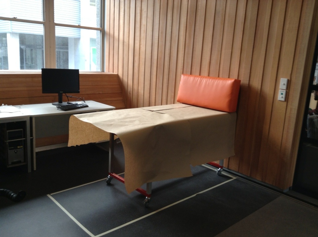

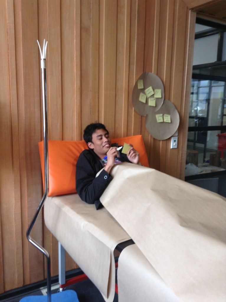

So to test the my ideas I made up a bed and did tests to validate positioning and whether it was relevant to split up the information, I had a feeling it would clutter up the space and I was right. When looking at it, saving two separate sheets makes it look confusing. Observations were found in the positioning and movement of the patients head being able to view it with a slight turn,which validates my hinge ideas. Putting the book lie interaction actually helped me in deciding the position or the design on the actual board it’s simple and it hides the clinical information. I also got got the patient to play with the post notes the idea of being able to take away and leave message came through strong. So doing tis validates my ideas and convinces me of my line of thinking.


So basically now I have the general idea of what I’m do, I want to focus on a good cheap way of getting it to hinge from the wall. Adding metal hinges would make it look cheap tacky and like something that’s been put together on the spot. So figuring out how to do it nicely will be the key. I decided to hinge it basically of the wall because in a way it’s getting it of the wall and improving the interaction with the patient improving the physical comfort in such a simple way as shifting the head to view information. And this way it is hidden form other people so it keeps it private and personal.

So I went to

So I went to Middlemore to visit a friend, she’s fine now :), and took the opportunity to photograph the space. So I looked at the back of the wall space and noticed how cluttered and clinical it looked, the space wasn’t utilised nicely. There were no patient status boards either! The only thing I sore were four little whiteboards at the entrance of the room with with each of the patients names within the room. So it was definitely a good visit to get perspective on how things are run else where.
